 For the chase scenes me and Liam decided to buy an extension to the school's go-pro. The extension allows us to film the actor's face without them having to hold the camera, we thought this would be ideal for the chase scenes. We thought allowing the audience to see their facial expressions will be more effective and create more suspense.
Wednesday 31 December 2014
Go-Pro Strap Extention
For the chase scenes me and Liam decided to buy an extension to the school's go-pro. The extension allows us to film the actor's face without them having to hold the camera, we thought this would be ideal for the chase scenes. We thought allowing the audience to see their facial expressions will be more effective and create more suspense.Friday 19 December 2014
Social Media

 I decided to add social media logos on both my Digipak and my poster. I did this because my demographic would be young adults and they are the generation which relies on social media the most today. Bands today rely on social media to create a fan-base and promote new music and update them on tours and other news that would interest them. Bands with an older demographic usually post their news and tour dates in magazines such an the NME. The NME is also targeted for upcoming bands as well but the NME also focus on all demographics and keep the older bands stick to tradition.
 Here's an example of an indie-rock band using social media to update their fans and letting them know what they've recently been up to.
Wednesday 17 December 2014
Animatic
Using our storyboard, Liam put together an Animatic with the storyboard in sync with the music. I think this was a big step for our music video because we now know that our narrative will be fine for the amount of time the song runs for, which is shorter than most music videos. At the moment I can't see us needing to change anything to the narrative as it all fit in perfectly and we structured it so the narrative is still clear in less than three minutes.
Friday 5 December 2014
Storyboard
This is the storyboard for Brainstorm, me and Liam decided to have both narrative and studio in our music video due to the studio clips being fitting to the band's genre. The narrative is about Brain, a boy who is too big for his boots and thinks he can get away with anything. Brain hooks up with a girl in the night and finds himself in her bed the next morning, juxtaposing this the girl's boyfriend is arriving home and Brain runs past him. A chase scene begins and Brain ends up being beaten up in the middle of nowhere with no help.
The edits


These are the edits I made for my digipak panels. I decided to drop the idea of colours as I thought it didn't go well with the genre and more pop as the pop band JLS were iconic for each member having their own colour. I decided to go for a black and white theme as I could focus on contrast more and would have more availability for it to fit the genre more. I really like how Sam and James' edits came out, however I feel like Chris and Jordan (the bottom two) photos need to be touched up on Photoshop again as the lighting is a little incorrect compared to the others. I am going to play around with the size proportion of the photos as well because I feel like Chris and Jordan's are more zoomed out. I really like this black and white filtered idea rather than the colour idea. I edited all the images by using the levels and exposure on Photoshop and tried not to be too harsh on the amount used on the images so the faces are clear whilst the back of them is a clear black.
4th Shoot

Monday 1 December 2014
Friday 28 November 2014
3rd Shoot

I am slightly concerned if this turns out slightly different to the other images when the editing and filtering is put on with this and the other images but I think due to the lamp still being in the same place the levels of the image will still be fine. I am pleased I decided to go back and reshoot with Jordan again because I feel like this image is a huge improvement to the one we originally took.
Locations
After finishing our storyboard and animatic we decided to look
into our storyboard more clearly to decide where we are filming all our shots.
We are slightly concerned about getting our cast to all of these locations but
we feel as if these locations would be perfect for the shots we have drawn in
the storyboard. We have been given permission to go to Tile Kilns Wood, Liam
messaged the land owner and told us he was happy for us to shoot on his land.
Tile Kilns Wood /
Marwood house:
At Tile Kilns wood
we will be shooting our chase scenes. Once the brothers and Brain get out of
the car they will be in this location where Brain will be chased by the girl's
brothers.
Jordan Murphy's
house:
Jordan will be in
the music video himself, he is part of the band and will be in the drama studio
clips and perhaps even play one of the brothers. At his house we will be
shooting the night before shots when Brain goes back to the girl's house after
a night out. Then the following morning will be filmed in the house when the brothers
return home and he runs out the door. The plan of Jordan's house is best
suitable for filming, whereas the filming may of been a little awkward and
cramped in one of our houses.
Drama Studio:
The drama studio will show the band
performing the song. This is to include goodwin's theory of the band's image.
They will be performing in a black studio room, the same one as we took our
images for our digipak and poster from. The drama studio will be mainly used at
the beginning of the music video and will be the location that we use the
least.
Wednesday 26 November 2014
Digipak progress

I feel happy with how my Digipak is progressing. Unfortunately, I still do not have an image of Christian for the CD panel so I am currently using the image of Elton from my test shot to have an idea of how my Digipak is going to look. I have not yet started my front cover or back cover yet as for my front and back cover I want images of all the band together, I thought it would be best to get these images when we are filming the clips for our music video when the band will be performing in the drama studio, which is the same room which these photos were taken in. We are aiming on filming this at the beginning or middle of December so I feel like this won't be an issue and I have the time to finish off and perfect my Digipak.
My other idea was for the front cover to be of the band and the back cover to be of the drama studio door vaguely being able to see them inside with the tracklist on the door. However, from the feedback I got when telling other students about this idea, they were not keen and thought I should just get two different style images of the band together for the front and back and for the front cover to obviously be a lot stronger than the back. I took the critism well and we try out both ideas still although after the students contributing back that feedback I feel like their idea for me will work better.
2nd shoot

 Me and Liam begun taking photos of the band we are using in our music video for our Digipaks, the first two boys we was able to take photos of was Sam And James, at the moment we are thinking for these two to perhaps be the two guitarists or guitarist and drums. However, when taking these photos we used a lamp and placed it below them to be able to get this effect of the shadow directly behind them and not to the side. These shots to took a while to get right due to the shadows and black background but the end results made me feel proud as they came out exactly how I wanted them to. I prefer these images to the first two photos which we took. In the two test shots we took of Elton and Jordan, we decided Jordan had the right image for our band aswell so he is now going to be put into the band with James, Sam and Chris. I am going to retake Jordan's photo as the lighting is different for his photo and the position is slightly different to these two images. I feel like it would be best to just redo his photos due to the way we perfected using the light in the black drama room. I am excited to see how the digipak is going to turn out.
Sunday 23 November 2014
Class feedback from pitch


From the feedback we got back from our class we got a lot of positive responses and it made us feel like our pitch and ideas are reliable and successful. We did receive some criticism on our moodboard which is understandable as we have minimal images that relate to the band. The feedback made me feel comfortable with the position that we are in and as our storyboard and animatic is now complete after we received the responses I feel like we are ready to develop our plans and ideas.
Friday 21 November 2014
Original Brainstorm video
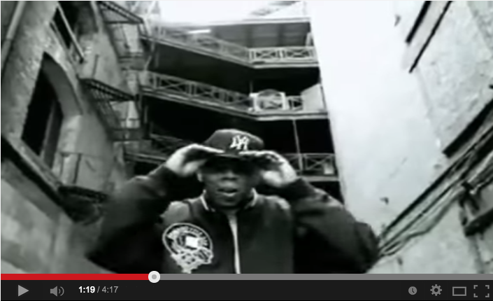
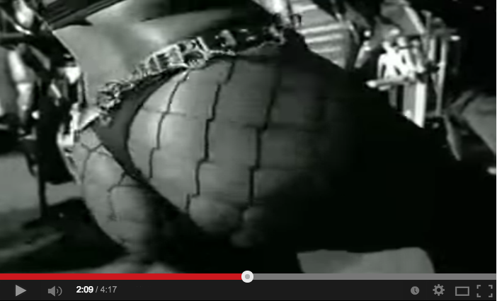
This is the original music video of the song me and Liam have decided to use. Personally, I do not like the music video as I feel like it the dancers do not fit the conventions of a indie-rock band. The scientific images connote that the song is about drugs however when me and Liam briefly analysed the lyrics we got the idea of a boy being cocky and outgoing, some lyrics can arguably connote drug use which this video seems to follow.
I like how the video uses holiday snaps of Brain's character as it brings humour to the video and an understanding that there is a man called Brian in the story of the lyrics. I also like the shots of the band performing as the sepia and pale colouring does connote well to the genre of the band. Despite not liking the performers in the video, I like how the performance is edited so it fits the drums and bass in the song.
The song does not use much Goodwin, the only lyric and visual I can notice from the video is the introduction when the vocalist says 'Brian' and a photograph of a man appears. The music and visual could arguably be applying Goodwin and the dancers are fast past just like the song is. Their record label and image is definitely being shown through the performance scenes but not as much as other Arctic Monkeys videos do. The band objectify the women in the video and apply male gaze, an example of this is at 1.28 when it shows a dancer's body and then highlights it more in a jump cut.
I do not like the music video much but I can see where the music video applies Goodwin theory and it is clear how they do, it could be arguably be applied more but the dance routine seems to take up the majority of the music video. There is no narrative and it is just two contrasting performances which convey the rhythm of the song.
Thursday 20 November 2014
The Pitch
This is the pitch we presented to our class to receive feedback to improve our ideas and have a clear image of what our target audience would like to see or to see improved. Liam put together the powerpoint and I feel like the way it was put together settled our audience to thinking for an indie rock genre due to the use of frequent contrast of black and white which most people our age pick up on indie bands for today due to band such as The 1975. I am proud how our pitch turned out and I felt like it was presented with thought and consideration. The only aspect of our pitch I feel like we slightly neglected was the moodboard which is something we could go back to.
Friday 7 November 2014
Wednesday 5 November 2014
Primary research for choice of font
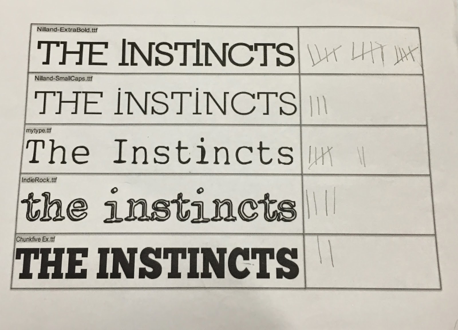
Me and Liam went on dafont together and picked out 5 different fonts which we liked and thought matched the indie rock genre that we wanted our band to be. We went around the common room, which allowed us to get opinions from the target audience which we said would listen to this indie in our audience profile. It is the same age range as the audience profile however we asked girls aswell as boys when doing the research. We thought using both genders may allow us to reach the most creative and presentable option we can. We ended up asking 31 people and 15 which is nearly half decided on the top option.
We was both happy with the response of that choice because as you can see we put two choices of the same font "Nilland" but one more narrow than the other which shows we was considering this font more than the others from the start of the research. One of the fonts called "my type" also got 7 votes. I also like this font aswell but I felt like the typewriter font was very generic and typical for the genre we are approaching. The "indierock" font also got a reasonable amount of votes (4) but we thought the font looked slightly immature and wouldn't fit the image we already have planned to go for.
The research was productive despite already having a favourite font before handing out the options. It has made not bias to our band's font as it was a clear favourite from the age range we are aiming to target. The font chosen in my option also fits the edgy and quirky song we are using for our music video.
Tuesday 4 November 2014
Production Log #2

 For my second shoot me and Liam got other people to take photos of. As our digipaks have to be individual we are editing and using the photos differently for our digipaks. As I liked the coloured image from our first shoot more than Liam did I decided to carry on the idea of a pop art influenced images. I decided to consider these two images for the inside of the digipak, to progress to idea I want to take two new images with different boys in, I would most likely copy the colour theme using the colours red and green. The only doubt I have using a colour theme to my digipak that it doesn't fit well with the indie rock genre. I will have to make another plan of a digipak to see if I can fit in some conventions. I like how using a black wall I was able to edit the images so the background is a clear black but the image of my band members has a sense that they have importance and they are forward in the image.
I did have another boy I took images of but unfortunately it was not lined up as well as these two were. I definitely need to take two more images like this so I have a complete set of the band member's single shot. I am still unsure of what to have as the front cover of my digipak as the cover having four faces split into one was difficult and when playing around on Photoshop I believed that it looked wrong and not as effective as I would have liked it to me. I feel like this idea is more effective and looks professional but my only concern is if this idea can be fitted into the indie rock genre.
Audience Profile

After creating a band profile I decided to create a matching audience profile aswell. I decided to create an audience of young males based on the fact that the type of people who listen to the genre of music we are working on are males that are in our sixth form. The audience indie rock seems to attract is males because of the boysterous image the bands usually give. There is not many female connections with an indie rock band's image. As indie rock is a sub genre they usually have a smaller audience than other bands in the media, because of this I decided to include that this person is keen on music magazines such as NME and social media which allows us to interact and find out about new upcoming bands.
Tuesday 28 October 2014
Testshots and Photoshop


Using our first test shot image we decided to try different effects on photoshop which would be more niche. We looked into using a 'pop art' themed front cover. Liam was not as keen on this idea so as we have to come up with different Digipaks I think I may try and develop this idea myself. The only thing I am not keen about in these images is that the logo is also been changed colour although that could easy be fixed on Photoshop. I love the posterised effect to these images and how using a black wall in the original image has made the background turn to a bold black colour when using filters.
When taking another shoot I most definitely will play around with colour again but in another style. After this shoot I will begin to start using people which will be included in our music video so the Digipak and the music video are corresponding. I am excited to continue using Photoshop and developing new ideas with it as the Digipak has a lot of different potential ideas which could be developed with the genre we are doing.
Friday 24 October 2014
Band Profile

I used Photoshop to create a band profile using the likes, dislikes and a small brief and history of the band that me and Liam created in lesson. I added these notes onto the profile as I feel like they are essential to portray the band's attitude. I also added images at the bottom which are relevant to the band's influence. I added locations such as a pub, inside venue and a festival. I also added band influences of the Arctic Monkeys and The Libertines. Stereotypes to the indie rock audience have also been added, the outfit and style of the man and the use of vinyl.
Thursday 23 October 2014
Production Log #1

23/10/2014 - Testshots
On Thursday me and Liam decided to get some test shots for the digipak and poster before breaking up for half term. We decided to do this because we needed black rooms/space which we thought would be difficult to find outside of school as in school we have drama production rooms and gallery rooms. We decided to go for a theme of a black background behind someone due to the influence of other indie rock bands. One example of this being done is an Arctic Monkeys cover and another album which a similar idea to it is a Kings Of Leon album cover.
We used a studio light to shine upon our band member's face, which for this testshot was Liam himself. When turning on the light we realised it was too bright for the image we was going for so out of black card we created a cover for it with a slit in the middle. The middle slit was aimed to go onto the eyes and less on other facial features. This idea unfortunately did not work but it was a good experience to try and create someone like this for future preparations.
We successfully got an image that we both liked. We took this into Photoshop and added lighting and filters onto it. I think playing around with different effects at this stage was helpful to create an idea for what we both want for our digipaks.


These are the two album cover ideas we both ended up with. The first has the lightening enhanced on it. This edit of our image reminds me of the Arctic Monkeys' album cover "Whatever People Say I Am That's What I'm Not". The similarities of both would be the central image of a person. Both give a edgy and not a friendly image which could be connoted with the genre of indie rock being quite urban. The dark colours are also an obvious similarity however I feel like the black and white would not look as good with our image like it does with Arctic Monkey's cover. We decided to add our chosen band logo to the image to see if it would look correct together. I feel like the logo could be improved by adding a box of a contrasting colour behind it like the Arctic Monkeys' one. This would make our logo more clearer which is needed as a band is being portrayed as a new upcoming band. The Arctic Monkeys' cover also doesn't contain the album name but for my digipak cover I would want to contain that as they are an upcoming band and this is their first album.
Friday 17 October 2014
Digipak first design


We then created the digipak idea onto Photoshop. I got a template of 6 squares and recreated the drawing I made in my notepad.
- Top left: Inside left
- Top middle: Centre
- Top right: Inside right
- Bottom left: the right/left fold
- Bottom middle: Back cover
- Bottom right: Front Cover
I realised once finishing that I have positioned the plan awkwardly on Photoshop. Since doing it on photoshop me and Liam decided to change the front cover to a split image of the four band members on one face / body similar to the Kings Of Leon - Only by the night. I used images of silhouettes to show the positioning of images once we have them as this is only a plan. On the back cover I left the text box empty which is meant to contain the track list as I wanted to show the image behind the box was one of the four band members.
Wednesday 15 October 2014
Green screen digipak analysis
I was very nervous recording my green screen despite me only speaking for one minute. After creating the video behind the green screen at school I found it incredibly hard putting my digipak behind me on Final Cut Pro, I was eventually able to do it by myself but unfortunately I am blocking images 3 and 5. I was unsure on how to fix it so proceeded because I didn't want to change the quality of the video as I thought I did a good job at making myself clear in the video and removing the green.


These were the images I unfortunately blocked out with my body so I decide them onto here. The image of the booklet of images of Michael Jackson through the years is image number 3. The other image of the bonus CD with the sound wave wallet is image number 5. I am frustrated how my green screen did not show a clear image of these two photos but I still feel like my green screen was a good first attempt and hopefully my next green screen in the future will be better.
Poster Analysis

I decided to analyse Arctic Monkey's most recent poster as I like the way it has the same theme as the CD cover itself. I think I would use this idea in the future because the poster and CD are matching to make the production of it all more easier. I think it's a more neat idea having the CD and poster having a matching theme because it stops our primary research pulling apart separate designs of our digipak and our poster.
 The band's logo is placed centre top of the album poster. This makes it stand out despite it not needing to be because their fans will recognise the text their name it is in because that has been their logo for several years. Underneath the logo is the image of their album cover. The sound wave gives away nothing about their genre of music but it could be suggest that this album will be more electronic than their other albums, however it is not. The only other thing I could think the waves stand for is this album is more slower than their other albums. There are slower rifts so the logo may suggest a more calm attitude for this album. Fans later found out that the sound wave was linked with the music video of 'Do I wanna know?' which could arguably be one of the most popular tracks on the album. I feel like Arctic monkeys took pride in this song considering they picked to use their album cover idea for the music video of it.
Underneath the image is the album name, which is quite unclear due to this album just being self titled when their other albums had witty album names such as 'favourite worst nightmare'. Due to it being unclear it says 'The new album' underneath to clarify that it has no name other than their band's initials. Following that, underneath there is the options of purchase which is CD, LP or download. The choice of the LP shows that the album is ideal for the indie culture as it is common to find indie albums and Eps on LP. Finally the last row of text tells the audience the date of the release, it would have been better to announce the time and year of the release to look more professional. Usually online releases start at 9AM.
Monday 13 October 2014
Genre which I want to use
 |
| Click to enlarge |
After deciding that I would like to do work based on the indie rock sub genre. I created a brainstorm of bands which are in that specific genre and the stereotypes I have picked out of that sub genre. I picked out the stereotypes by looking at 3 images of band members. The bands that I used to analyse appearances were: Drowners, Arctic Monkeys and The Kooks.
Drowners have a urban and street image of themselves as they have the rock conventions of skinny jeans and messy hair but they also are wearing snapbacks and panels. Their photo shoot was also took behind a vandalised wall. Arctic Monkey's image is more tidier, the lead singer Alex Turner has greased back hair and wears braces with a leather jacket. It could be argued that Arctic Monkey's image is influenced by classic rock and they wear more vintage smart style clothes in comparison to the 'messy' look. The Kooks' image was very metrosexual, the band members were wearing very feminine clothing but however are all straight men. They wear low cut tops and bowler hats which was unusual and I had never personally seen before in the indie rock scene. However they still had some of the classic conventions.
All bands had a lead male singer and were shown to play their own music. They all also have the same clothing image slightly as they all appeared to wear skinny jeans and darker choices of clothing rather than bright colours. In each band there one or more man with messy hair and stubble which seems to be an edgy and stereotypical look in recent rock.
Genre Brainstorm
 |
| Click to enlarge |
In lesson we was asked to break down the different types of genre. What have I learnt is that there seems to be more sub genres of rock than there is of anything else. This may be because I know the most about that genre but others in the class who are not known to listen to rock seemed to have known the same sub genres that I listed. There are different styles of rock and rock has been around for a long time which may be why the rock genre has more sub genres from the others.
The other genre which seemed to have a few sub genres was dance music. This is interesting as I would think that dance music is the most recent genre out of the ones I have brainstormed. Dubstep is also very recent. Dance music could be argued to be the most popular genre of music in society at the moment. The stereotypical thought of dance music is the music we hear in clubs, however we now hear these sub genres of music on the radio.
Thursday 9 October 2014
Music Video History
 Music videos were begun to be made in the 1920s. The most iconic music video of the 1920s which started the revolution of moving image with the audio was Bessie Smith, a jazz artist.
 Bessie's music video was known as a 'short film clip', it was called St Louis Blues and was realised in 1929. The short film clip shows Bessie singing by a bar and other people in the room singing along with their whilst sat on tables. The video is very basic but I feel like it is still influential with the idea of the music video not having just the artist in it.

 in 1975, Queen released a music video for their song Bohemian Rhapsody. This had rose a lot of attention and was seen as an incredible video in the 70s, this video was the first video ever to use advanced visual effects. The video contains an iconic 'honeycomb effect' on the 4 members of the band which had never been seen before on television music shows such as Top Of The Pops. Effects are used for the first 4 minutes of the video and then it cuts to a live video of them performing when the music becomes more hard rock.
It could be argued that these three iconic music videos could be where most influences of music videos come from today. Bessie's music video was a basic video of watching the artist performing their song, allowing the record label show off the artist's image. Bob Dylan's music video could be argued that it created the idea of lyric videos, there has also been parodies posted on the internet of the video which proves it caught a lot of media attention. Queen's music video was the first video using advanced visual effects which a lot of music videos use today. The video also shows the band performing live which also another type of music video bands do today so show off the different member's talents and their image on stage as a whole.
Wednesday 8 October 2014
Brief
OCR Exam Specification:
• a media portfolio, comprising a main and ancillary texts; • a presentation of their research, planning and evaluation in digital format(s).
Monday 6 October 2014

Friday 3 October 2014
Looking into band logos


We decided to look into band logos before creating our own one. We decided to look at four different band logos from a similar genre to what we are doing. From doing this we gathered that most indie rock / alternative rock bands usually have a logo which is black and white. The Libertines and Drowners logos have a sans serif font which is bold and blunt and stands out. However, Arctic Monkeys' and Kings Of Leon's logo contain serif font as it is more wavy and decorative. The serif fonts in my opinion are easier to remember the band's logo than the other two. I think sans serif stands out less as both band's logos containing that have an image or background with the font which has been chosen. For our band we decided we would prefer a serif font as it is generally more eye catching. When doing our research for logo font ideas we will also include sans serif fonts aswell to see what our audience would prefer.
Wednesday 1 October 2014
Wednesday 24 September 2014
Post Modernism
Post modernism is the idea that media produces an idea that any media product is of any greater value than another, all judgements of value is just taste. It is also said to reflect modern society's feelings of alienation, history, process or sometimes truth. Philosophy on postmodernism such as Jean-Francois Lyotard argue that recent economic changes produced particular 'structures of feeling' or 'cultural logic'.
MTV believe that we now live in a 'three minute culture' or that we are part of an over-visual society (society of the spectacle) due to the television and the internet shortening people's attention spans today.
It could be used that is idea has implications for the realist forms of media, this is because our sense of reality is now said to be utterly dominated by popular media images and cultural forms can no longer 'hold up the mirror to reality'. It is believed that today reality itself is saturated by advertising, film, video games and television images.
It could be argued that celebrities such as Madonna or Michael Jackson are examples of postmodernism as they have created different identifies for themselves. I feel like this is an interesting way to look at postmodernism as it is usually iconic to art pieces, not a person.
Sunday 21 September 2014
Wednesday 17 September 2014
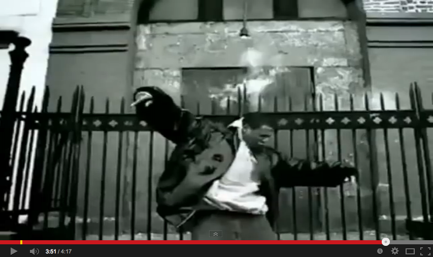
99 Problems Music Video Analysis
 Genre Characteristics:
The music video is set in an urban estate which is usually a characteristic to the hip-hop and rap style of music. The video contains young black people driving around estates or playing basketball, there are also shown wearing baggy clothes which is usually connoted with the rap sub-culture.
Voyteuristic:
 In Jay Z's music video it shows women a lot differently to how men are shown in the video. Firstly, there are sometimes short scenes of a mid shot of women dancing with not many clothes on. The use of the shot could value women as less important than the men in the video as the shots for the men are more close up. The second type of shot used on women is a close up shot of the women's breasts and bum when they are dancing.
Lyrics and visuals:

Record Label's style being portrayed:
The record label portrays them being towards the urban and street audience as they add all connotations of the street life in Jay Z's video. For example the idea of gangs and having issues with the police is something happening in the music video. By the end Jay Z is shot down but also looks cool whilst doing so. Jay Z is given a cool image with this upbeat track.

It could be believed that the dance routine shown 3 minutes into Jay Z's video is a mimic of one of Michael Jackson's dance routine. This may be used because Michael Jackson is a huge black icon and maybe the video is showing respect towards his talent.
Subscribe to:
Posts (Atom)